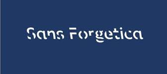
Want to try something different that is proving wildly successful in business and education? Try Sans Forgetica. Sans Forgetica is a font designed by researchers and graphics designers at RMIT. It is designed to be a font which acts like a highlighter for important terms you want your reader to better remember.
Sans Forgetica uses a number of proven learning techniques to draw your attention to the text you want to remember. The words are slightly tilted to the left and there are gaps in some letters. Shifting it backward and leaving gaps forces your brain to work a bit harder AND, when your brain works harder, you tend to remember it more. How about a 50% + increase in retention.
Here is a short video on this new font and its effectiveness.
Sans Forgetica is free to download. You can download it HERE. Once you download it, insert it into your windows system and it will connect with Word, PowerPoint and other systems. Instructions on how to add it are HERE. Really easy to do.
I am using Sans Forgetica in my new book – Prosper: Digital Marketing Strategies to Profit in the Digital Marketplace – to emphasize important terms. I’ll let you know how it works. Take a look at this interesting font and, if you use it, let us know how it works for you!

